Neither Shannon nor I is a trained designer. This is both frustrating and empowering – frustrating because each new technical skill we acquire takes more time than we expect, and empowering because we are not limited by what is customary. We are forced to develop creative solutions. One issue we needed to tackle as a clothing brand is our printed fabric.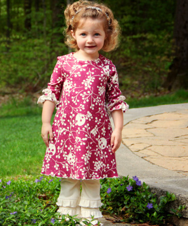
There are different ways to print fabrics. Three of the most common are rotary, digital and screen printing. Digital printing is a great option for samples, but is cost prohibitive for actual production. We’d love to do rotary printing, where a cylinder of ink is rolled over the fabric to imprint the design, but there is a shortage of U.S. rotary printers specializing in what we want: small batch printing with water based inks on fabrics provided to them by the customer. We use our own fabric that we have custom-knit to our specifications in Canada, of super-soft organic cotton, and though we are always searching, we have yet to find a suitable fabric from a U.S. mill. We are fortunate, though, to have found a supremely talented hand screen printer.
Our designs fall into two categories: reverse and positive prints. Our Twig Berries print was one of my first and most challenging designs.
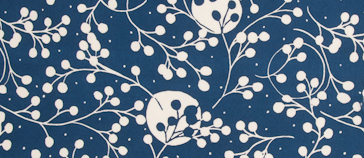
I created the print in reverse (meaning the design itself is not printed – it’s a void, empty space surrounded by a darker water-based ink) by hand-drawing with opaque ink on a mylar sheet.
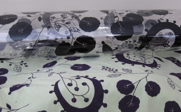
When complete, a screen measures roughly 36″ tall x 60″ wide, but I create the images in 20″ squares and puzzle piece them together (since not much more than 20” square will show on a garment at one time). The biggest challenge with a reverse print is maintaining a solid negative or “white” line across the entire top of the image. The line does not need to be straight and can twist and curve, but if it isn’t present, when the printer lays down the screens, the ink will overlap where the screens meet and create unwanted dark lines.
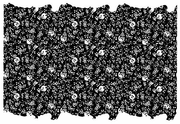
Why a negative image instead of printing the white on a solid colored fabric? Water based inks are transparent and soak into the fabric, leaving it soft to the touch. If you were to print on a darker fabric with transparent white ink, it would not appear white — it would only lighten the base fabric color. This can create its own effects, and we use this technique to create the lighter color in our butterfly print.
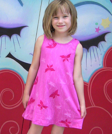 But to create a true natural or opaque white would require adding solids to the ink which would feel scratchy and possibly crackle on the surface of the fabric, so we avoid doing this by designing negative prints. The negative screen also gives us the ability to transform a natural colored base fabric into any hue we desire.
In our next post, we’ll walk through how we created our newest positive print, Medallions. (Read Part 2 here.)

Hi!
I am planning on using white water-based ink to print on black jersey fabric (toddler / baby blanket.) What would you suggest on how to go about this while avoiding the “stiff, cracking effect” once it’s being used and washed for everyday use? The print/design won’t be an all-over print like yours, but it will be a drawing taking most of the blanket.
Awaiting your reply! I don’t have any professional experience in printing either and your article came across as super helpful!