For Part 2 of our series, here’s a glimpse into one of the processes we used to create our newest organic print fabric for Adooka Organics. You can catch up on Part 1 here.

In Part 1 I described how we created a negative image print. For our positive image prints, we also start with hand drawings which we import into a digital program for image cleanup and formatting. Our forthcoming Medallions print (pictured above) was an accident of sorts. Shannon was drawing up a set of flowers as possible pieces for part of another yet-to-be-released print when it became clear that the overlapping flower images would make their own striking print.
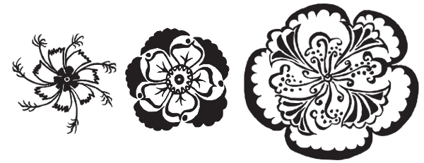
So I started out with scans of Shannon’s ink drawings, which she had digitally cleaned up so that they were solid black + white, like this:
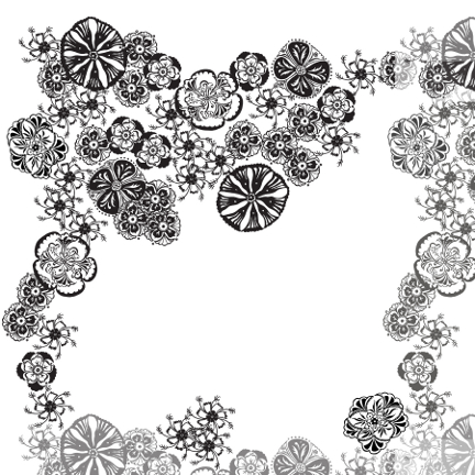
 Then I began layout out my 20″x20″ “jigsaw puzzle” repeat. In my previous post I described how each of our prints starts as a base section that is designed to be able to repeat itself both vertically and horizontally, fitting like a jigsaw puzzle piece. This is easy to create if you’re going for a geometric look, but we prefer an irregular, naturalistic design where the repeat isn’t easily spotted, making the task much trickier. Being a bit more advanced with my digital tools this time, I first laid out a wide swath along the top and left sides of my square. I then temporarily copied them to the opposite sides, to use as a guide for placing the rest of the images so that I knew the final composite image would fit together precisely. Here’s what it looked like at this stage:
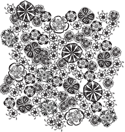
Then I filled in the center and erased the copied “guide” sections, voilà!:
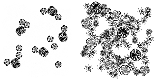
 Next I made sure we liked it in repeat, and added color to create a mockup of how the finished print will look. Here is what our base section looks like in repeat, with two different options for how to distribute the colors:
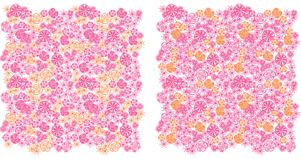
Tiny pics, but you get the idea. We chose the option on the right.
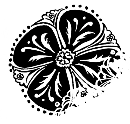
As in the development of our negative print, we needed a white dividing line to prevent overlap bleed in the printing process. This time we had another complicating issue, since this is a two-color print: creating negative space where the colors overlap. If you create a multiple color print, anywhere the two colors would print over each other would create a third mixed color. As that was not our desired effect this time around, I used a process to digitally isolate the overlap and remove one of the colors. A single flower looks like this once that is complete:
 We will have two screens made, one for each color, so next I separated the colors:
I laid out as many repeats as would fit across the width of our fabric horizontally and two repeats high vertically, and added targets in the four corners so our printer will know exactly where to line up the screens in order to overlay the colors and create a seamless repeat. I sent the digital files to the printer so he could burn the screens and do a test print on our fabric for our approval. Then we wait to receive our exciting package!
Shortly, you will see this new print on dresses and baby rompers from our new spring line! Follow us at our store Two Crows for Joy to be alerted when it’s out.
